library(waffle)18 Waffle charts
Pie charts are the devil. They should be an instant F in any data visualization class. The problem? How carefully can you evaluate angles and area? Unless they are blindingly obvious and only a few categories, not well. If you’ve got 25 categories, how can you tell the difference between 7 and 9 percent? You can’t.
So let’s introduce a better way: The Waffle Chart. Some call it a square pie chart. I personally hate that. Waffles it is.
A waffle chart is designed to show you parts of the whole – proportionality. How many yards on offense come from rushing or passing. How many singles, doubles, triples and home runs make up a teams hits. How many shots a basketball team takes are two pointers versus three pointers.
First, install the library in the console. We want a newer version of the waffle library than is in CRAN – where you normally get libraries from – so copy and paste this into your console:
install.packages("waffle")
Now load it:
18.1 Making waffles with vectors
Let’s look at Maryland’s football game against Michigan State from the 2022 season. Here’s the box score, which we’ll use for this part of the walkthrough.
Maybe the easiest way to do waffle charts, at least at first, is to make vectors of your data and plug them in. To make a vector, we use the c or concatenate function.
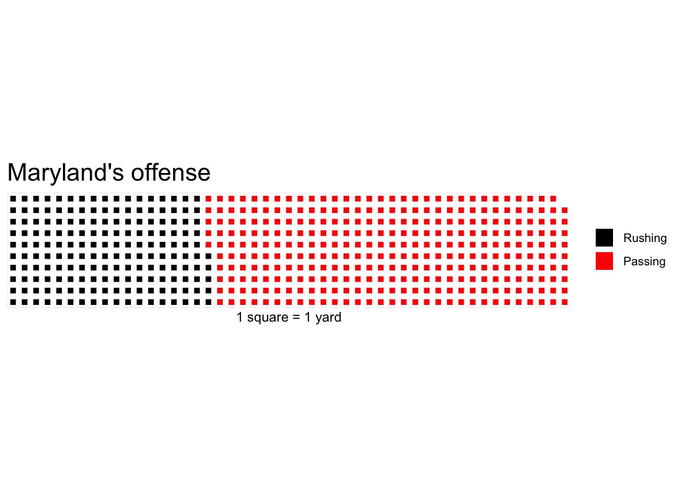
So let’s look at offense. Net rushing vs passing.
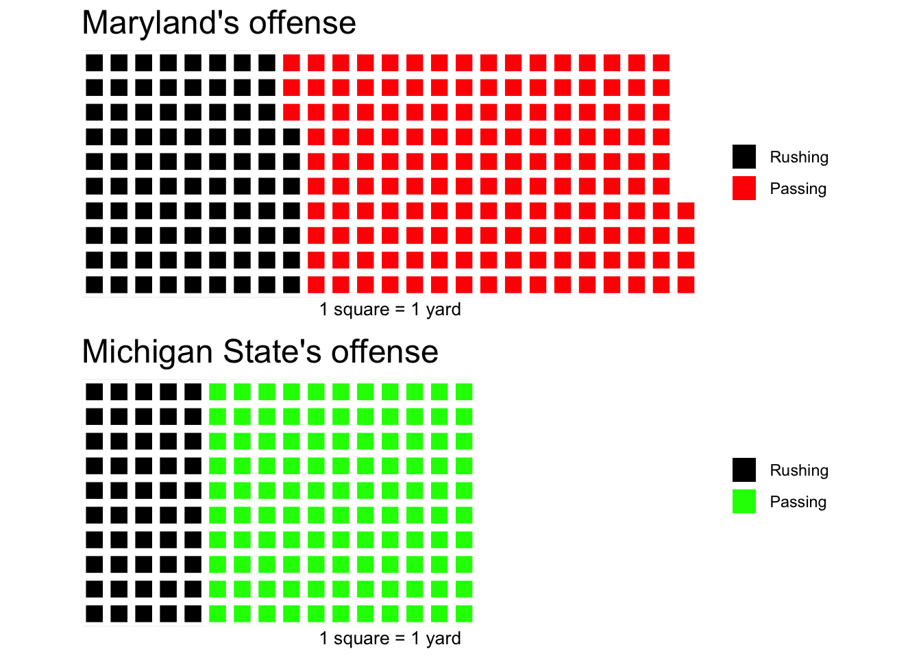
md <- c("Rushing"=175, "Passing"=314)
ms <- c("Rushing"=100, "Passing"=221)
So what does the breakdown of the night look like?
The waffle library can break this down in a way that’s easier on the eyes than a pie chart. We call the library, add the data, specify the number of rows, give it a title and an x value label, and to clean up a quirk of the library, we’ve got to specify colors.
waffle(
        md,
        rows = 10,
        title="Maryland's offense",
        xlab="1 square = 1 yard",
        colors = c("black", "red")
)
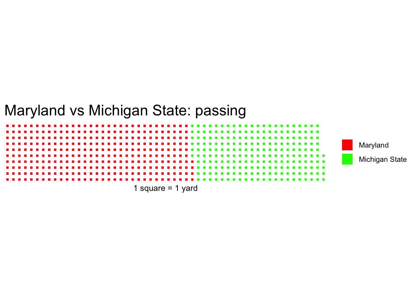
Or, we could make this two teams in the same chart.
passing <- c("Maryland"=314, "Michigan State"=221)waffle(
passing,
rows = 10,
title="Maryland vs Michigan State: passing",
xlab="1 square = 1 yard",
colors = c("red", "green")
)
So what does it look like if we compare the two teams using the two vectors in the same chart? To do that – and I am not making this up – you have to create a waffle iron. Get it? Waffle charts? Iron?
iron(
 waffle(md,
        rows = 10,
        title="Maryland's offense",
        xlab="1 square = 1 yard",
        colors = c("black", "red")
        ),
 waffle(ms,
        rows = 10,
        title="Michigan State's offense",
        xlab="1 square = 1 yard",
        colors = c("black", "green")
        )
)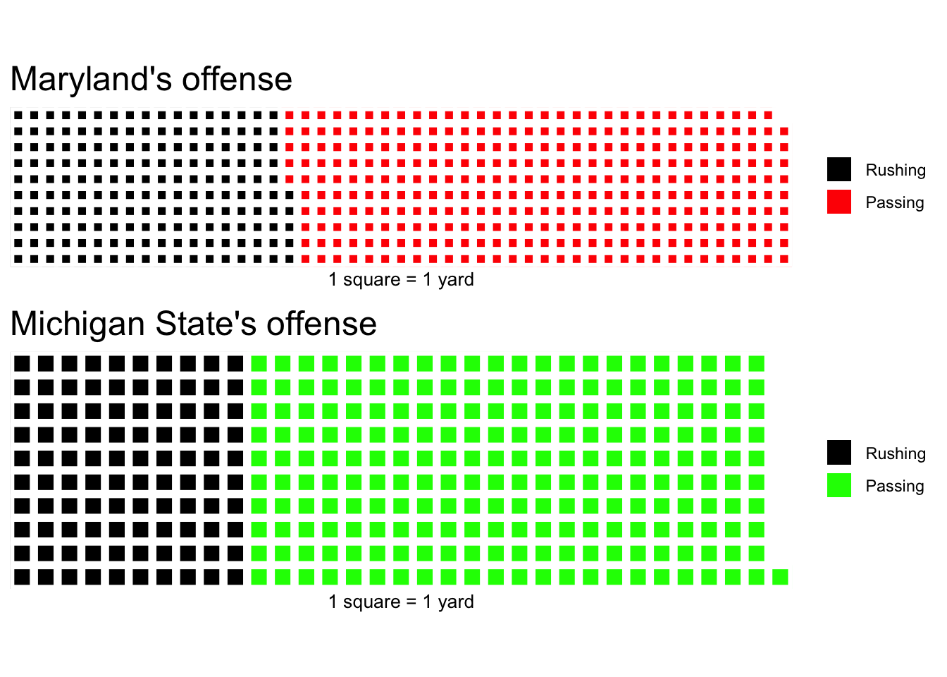
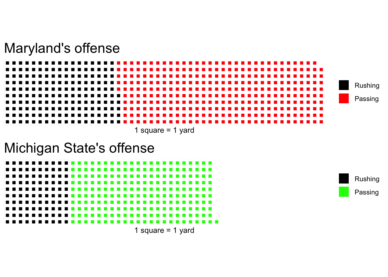
What do you notice about this chart? Notice how the squares aren’t the same size? Well, Maryland out-gained Michigan State by a long way. So the squares aren’t the same size because the numbers aren’t the same. We can fix that by adding an unnamed padding number so the number of yards add up to the same thing. Let’s make the total for everyone be 489, Maryland’s total yards of offense. So to do that, we need to add a padding of 168 to Michigan State. REMEMBER: Don’t name it or it’ll show up in the legend.
md <- c("Rushing"=175, "Passing"=314)
ms <- c("Rushing"=100, "Passing"=221, 168)
Now, in our waffle iron, if we don’t give that padding a color, we’ll get an error. So we need to make it white. Which, given our white background, means it will disappear.
iron(
 waffle(md,
        rows = 10,
        title="Maryland's offense",
        xlab="1 square = 1 yard",
        colors = c("black", "red")
        ),
 waffle(ms,
        rows = 10,
        title="Michigan State's offense",
        xlab="1 square = 1 yard",
        colors = c("black", "green", "white")
        )
)
One last thing we can do is change the 1 square = 1 yard bit – which makes the squares really small in this case – by dividing our vector. Look, it’s math on vectors!
iron(
 waffle(md/2,
        rows = 10,
        title="Maryland's offense",
        xlab="1 square = 1 yard",
        colors = c("black", "red")
        ),
 waffle(ms/2,
        rows = 10,
        title="Michigan State's offense",
        xlab="1 square = 1 yard",
        colors = c("black", "green", "white")
        )
)
News flash: Michigan State is changing its fight song to “Everybody Hurts” by REM.