library(tidyverse)16 Stacked bar charts
One of the elements of data visualization excellence is inviting comparison. Often that comes in showing what proportion a thing is in relation to the whole thing. With bar charts, we’re showing magnitude of the whole thing. If we have information about the parts of the whole, we can stack them on top of each other to compare them, showing both the whole and the components. And it’s a simple change to what we’ve already done.
We’re going to use a dataset of college basketball games from this past season.
For this walkthrough:
Load the tidyverse.
And the data.
games <- read_csv("data/logs25.csv")Rows: 11962 Columns: 60
── Column specification ────────────────────────────────────────────────────────
Delimiter: ","
chr (10): Season, GameType, TeamFullName, Opponent, HomeAway, W_L, OT, URL,...
dbl (49): Game, TeamScore, OpponentScore, TeamFG, TeamFGA, TeamFGPCT, Team3...
date (1): Date
ℹ Use `spec()` to retrieve the full column specification for this data.
ℹ Specify the column types or set `show_col_types = FALSE` to quiet this message.What we have here is every game in college basketball this past season. The question we want to answer is this: Who were the best rebounders in the Big Ten? And what role did offensive and defensive rebounds play in making that happen?
So to make this chart, we have to just add one thing to a bar chart like we did in the previous chapter. However, it’s not that simple.
We have game data, and we need season data. To get that, we need to do some group by and sum work. And since we’re only interested in the Big Ten, we have some filtering to do too. For this, we’re going to measure offensive rebounds and total rebounds, and then we can calculate defensive rebounds. So if we have all the games a team played, and the offensive rebounds and total rebounds for each of those games, what we need to do to get the season totals is just add them up.
games |>
  filter(!is.na(TeamTotalRebounds)) |>
  group_by(Conference, Team) |>
  summarise(
    SeasonOffRebounds = sum(TeamOffRebounds),
    SeasonTotalRebounds = sum(TeamTotalRebounds)
  ) |>
  mutate(
    SeasonDefRebounds = SeasonTotalRebounds - SeasonOffRebounds
  ) |>
  select(
    -SeasonTotalRebounds
  ) |>
  filter(Conference == "Big Ten MBB")
# A tibble: 18 × 4
# Groups: Conference [1]
Conference Team SeasonOffRebounds SeasonDefRebounds
<chr> <chr> <dbl> <dbl>
1 Big Ten MBB Illinois 408 982
2 Big Ten MBB Indiana 292 754
3 Big Ten MBB Iowa 250 731
4 Big Ten MBB Maryland 321 881
5 Big Ten MBB Michigan 346 950
6 Big Ten MBB Michigan State 386 972
7 Big Ten MBB Minnesota 271 702
8 Big Ten MBB Nebraska 270 876
9 Big Ten MBB Northwestern 302 709
10 Big Ten MBB Ohio State 252 716
11 Big Ten MBB Oregon 285 829
12 Big Ten MBB Penn State 242 711
13 Big Ten MBB Purdue 302 776
14 Big Ten MBB Rutgers 304 720
15 Big Ten MBB Southern California 262 759
16 Big Ten MBB UCLA 325 692
17 Big Ten MBB Washington 257 672
18 Big Ten MBB Wisconsin 279 945By looking at this, we can see we got what we needed. We have 14 teams and numbers that look like season totals for two types of rebounds. Save that to a new dataframe.
rebounds <- games |>
  filter(!is.na(TeamTotalRebounds)) |>
  group_by(Conference, Team) |>
  summarise(
    SeasonOffRebounds = sum(TeamOffRebounds),
    SeasonTotalRebounds = sum(TeamTotalRebounds)
  ) |>
  mutate(
    SeasonDefRebounds = SeasonTotalRebounds - SeasonOffRebounds
  ) |>
  select(
    -SeasonTotalRebounds
  ) |>
  filter(Conference == "Big Ten MBB")
Now, the problem we have is that ggplot wants long data and this data is wide. So we need to use tidyr to make it long, just like we did in the transforming data chapter.
rebounds |>
  pivot_longer(
    cols=starts_with("Season"),
    names_to="Type",
    values_to="Rebounds")
# A tibble: 36 × 4
# Groups: Conference [1]
Conference Team Type Rebounds
<chr> <chr> <chr> <dbl>
1 Big Ten MBB Illinois SeasonOffRebounds 408
2 Big Ten MBB Illinois SeasonDefRebounds 982
3 Big Ten MBB Indiana SeasonOffRebounds 292
4 Big Ten MBB Indiana SeasonDefRebounds 754
5 Big Ten MBB Iowa SeasonOffRebounds 250
6 Big Ten MBB Iowa SeasonDefRebounds 731
7 Big Ten MBB Maryland SeasonOffRebounds 321
8 Big Ten MBB Maryland SeasonDefRebounds 881
9 Big Ten MBB Michigan SeasonOffRebounds 346
10 Big Ten MBB Michigan SeasonDefRebounds 950
# ℹ 26 more rowsWhat you can see now is that we have two rows for each team: one for offensive rebounds, one for defensive rebounds. This is what ggplot needs. Save it to a new dataframe.
reboundslong <- rebounds |>
  pivot_longer(
    cols=starts_with("Season"),
    names_to="Type",
    values_to="Rebounds")
Building on what we learned in the last chapter, we know we can turn this into a bar chart with an x value, a weight and a geom_bar. What we are going to add is a fill. The fill will stack bars on each other based on which element it is. In this case, we can fill the bar by Type, which means it will stack the number of offensive rebounds on top of defensive rebounds and we can see how they compare.
ggplot() +
  geom_bar(
    data=reboundslong,
    aes(x=Team, weight=Rebounds, fill=Type)) +
  coord_flip()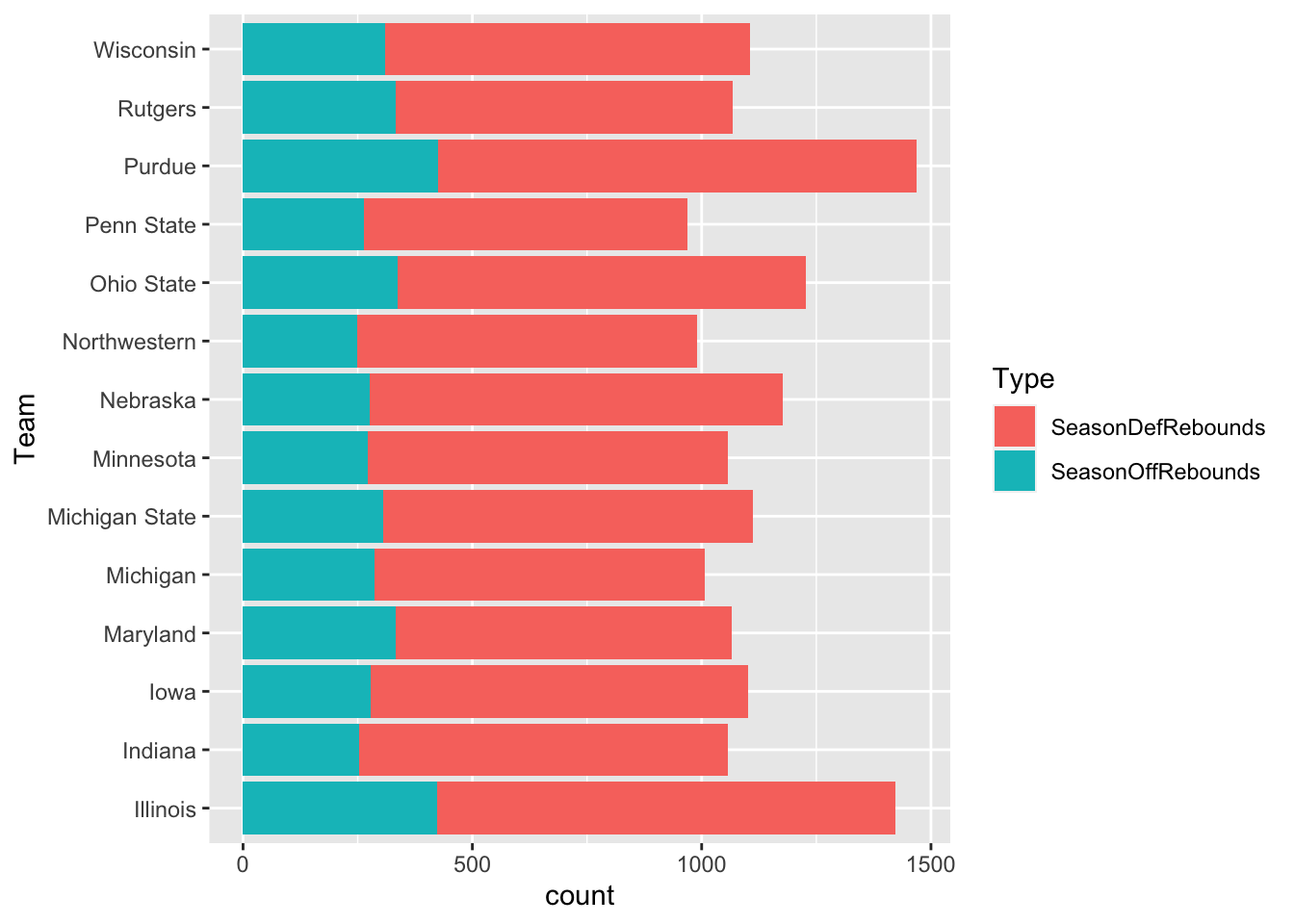
What’s the problem with this chart?
There’s a couple of things, one of which we’ll deal with now: The ordering is alphabetical (from the bottom up). So let’s reorder the teams by Rebounds.
ggplot() +
  geom_bar(
    data=reboundslong,
    aes(x=reorder(Team, Rebounds),
        weight=Rebounds,
        fill=Type)) +
  coord_flip()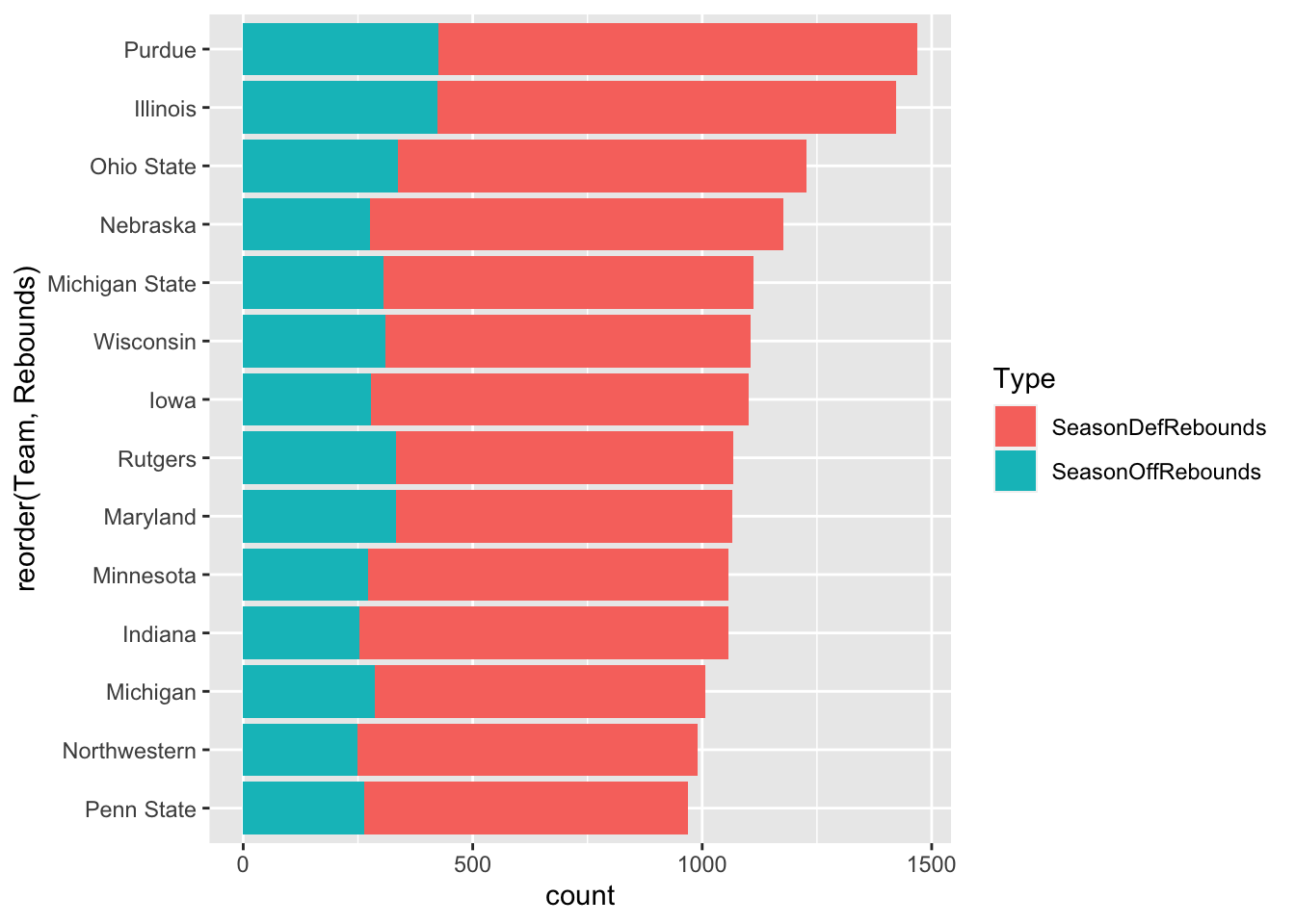
And just like that … Michigan State, the team with the best record in the league, comes out #2 behind Illinois. Maryland is fifth, which seems about right.